A buyer stands in a showroom deciding between two appliances that do roughly the same thing. One has a crisp, solid nameplate that still looks like the day it shipped. The other has a badge with a corner starting to lift and a logo that has gone faintly dull from cleaning. Nothing about the machine inside has changed, but one of them now reads as cheaper, and the graphic did that. On appliances and consumer products, the nameplate and the product label carry the brand at the exact moment someone is judging it, and durable graphics are what keep that judgment on your side. Get the materials wrong and the label undermines the product it is supposed to sell.
Here is the thing most people miss: a durable graphic is not a printing problem, it is a materials problem. The image is the easy part. Whether that image survives handling, cleaning, heat, and years of use comes down to the stack of substrate, ink, overlay, and adhesive underneath it, and whether those layers were chosen for the real environment or for the quote. If you own product branding or the technical outcome on a nameplate program, understanding that stack is what lets you spec a graphic that lasts as long as the product does.
A durable graphic is a stack, not a print
Think of a nameplate or a durable label as a small engineered assembly. The substrate or face material gives it body and dimensional stability. The printed layer carries the image and color and has to resist fading and wear. A protective overlay or hardcoat, on many parts, shields the print from abrasion and chemicals. The adhesive bonds the whole thing to the product and has to match that specific surface. Each layer has a job, and a weakness in any one of them shows up later as a field failure. A brilliant print on the wrong adhesive still peels. A perfect adhesive under an unprotected ink still scuffs dull.
The stresses are what should drive every one of those choices, so be honest about them up front. Appliance and product graphics face heat and humidity cycling, cleaning chemicals and solvents, constant handling, and UV exposure for anything used or displayed near light. A graphic that shrugs off abrasion can still fail on chemical contact, and one that handles heat can still lift off a difficult plastic. That is why the environment has to be defined before a single material is picked, and why a supplier who quotes a durable label without asking where it lives is guessing. Our work for appliance and consumer product manufacturers starts from those conditions and builds the stack backward from them.
The two choices that decide whether it lasts
Two decisions carry most of the durability, and both are easy to get wrong on price. The first is how the print is protected. For demanding applications, subsurface printing is one of the most reliable constructions there is. The image is printed on the underside of a clear, durable face film, so the film itself becomes a permanent shield over the ink. Abrasion, fingernails, and cleaning wipes hit the tough film instead of the print, which is why a subsurface nameplate can look new after years of service while a top-printed label in the same spot would have scuffed dull. It costs more and has to be engineered correctly, since the print, film, and any backing must be compatible, but for premium or long-life products it is usually the right answer. Where a surface print is the better fit, a matched laminate does related work by putting a durable layer between the ink and the world.
The second decision is the adhesive, and it is where a lot of otherwise good graphics fail. The low-energy plastics common in appliances and consumer housings resist bonding, and an adhesive that grips steel can lift right off a textured polymer. The adhesive has to be matched to the exact surface, its texture, and its temperature exposure, which is why the single most useful thing you can tell a manufacturer is what the graphic actually mounts to, down to the plastic type or coating if you know it. That one detail lets us specify an adhesive that stays put instead of one that tests fine on a flat coupon and creeps off a real curved housing in the field.
Prove it before it ships on ten thousand units
You do not want to learn about a durability problem after the graphics are on a production run. Validation is how you find it first, and it is not complicated. Define the real service environment, pick a candidate stack matched to it, then apply samples to the actual product surface rather than a stand-in. Put those samples through the stresses the part will really see, the cleaning, the handling, the heat, and confirm that adhesion, legibility, and appearance hold before you release full production. A prototype run on the true substrate is cheap next to a field failure, and we offer prototyping without tooling fees precisely so that step is easy to take.
Where regulatory durability applies, such as recognized label-permanence requirements for rating or safety plates, build the validation around the specific standard your product has to meet, and confirm that requirement with your compliance team rather than assuming it from a general rule. Designing to the right standard from the start costs a fraction of a recall or a reprint. This is the same materials-first discipline we walked through for harsher settings in our guide on choosing graphics that survive real-world conditions, and it scales straight down to a nameplate on a consumer appliance.
It helps to price the failure, not just the part. A nameplate is a small line on a bill of materials, so it is tempting to source it on cost alone. But when a badge lifts or a label goes dull in the field, the cost is never the nameplate. It is the return, the warranty conversation, the service call, and the quiet hit to how a buyer rates the whole product the next time they see your brand. A graphic that fails on a premium appliance does not read as a graphics problem to the customer. It reads as a quality problem with the machine. Weighed against that, the difference between a cheap label and a properly engineered one is rounding error, and spending it is the obvious call.
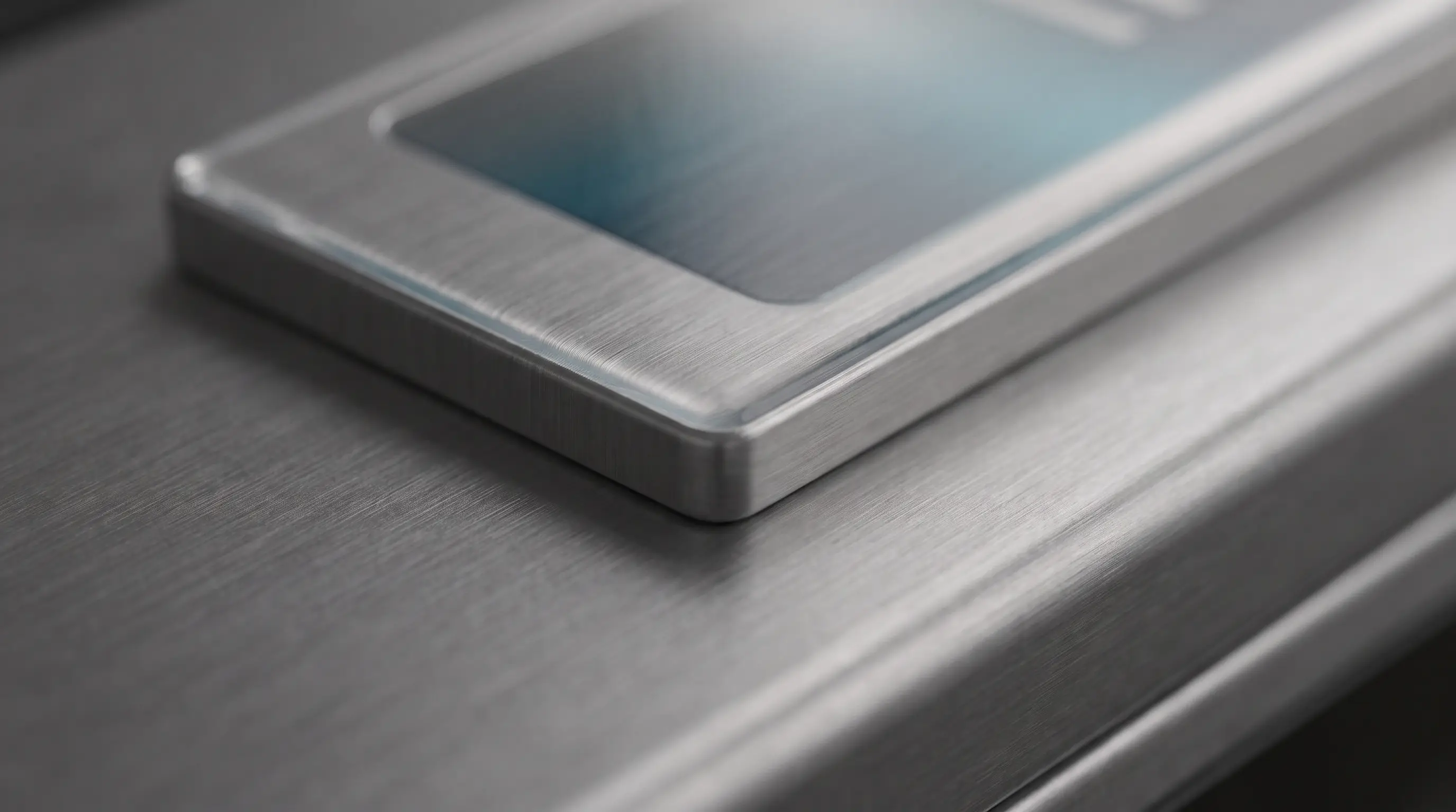
Finish and feel are brand decisions as much as durability ones, and they are easy to leave off a spec. A matte surface reads as understated and modern, a gloss reads as vivid, a brushed or metalized film reads as premium, and a subtle texture changes how a control feels under a hand. Those choices shape how the product is perceived before anyone reads a word on it. They also interact with durability, since some finishes hide wear and fingerprints better than others in a high-touch spot. The point is to decide the look and the feel on purpose, alongside the material, rather than accepting whatever the cheapest construction happens to produce and discovering later that it undercuts the product it sits on.
When you bring a nameplate program to a manufacturer, hand them four things and the job goes smoothly: the exact surface it mounts to, the real environment it lives in, the brand color it has to match, and the finish and feel you are after. With those in hand, a capable partner can recommend a stack, prove it on your actual product, and lock a standard the reorders hold to. Leave any of the four to assumption and you invite the exact failures this whole piece is about. The good news is that none of it is exotic. It is a short, specific conversation at the start that saves a long, expensive one later.
Color consistency deserves the same rigor, because it is a materials question as much as a printing one. Substrates and inks can drift slightly between lots, and a metallic or brand color that shifts is obvious the moment a new unit sits beside an older one on a shelf or a showroom floor. A manufacturer who controls incoming materials, keeps your color standards on file, and proofs against them holds appearance steady as you scale. Tell us up front when a color has to match across nameplates, labels, and other components, and the whole set gets managed to one standard. Send a physical color target rather than a screen value when you can, because a number on a monitor and a printed swatch on your product are not the same thing, and the swatch is what your customer actually sees. That gap is where brand colors quietly go wrong. Durable product graphics reward a partner who thinks in materials, and if you bring us the surface, the environment, and the volume, our custom graphics team can help you build a nameplate that outlives the doubt, and keeps representing the product long after the sale is made.